
2027 Bathroom Colour Trends: Quiet Minerals, Grounded Greens & Moody Depth
Colour in a bathroom should never be considered in isolation.
At Waterblessed, we look at the relationship between colour, tile, stone, timber, texture, sanitaryware and metal finishes to create a room that feels resolved as a whole. A beautiful paint colour may start the conversation, but it is the way that colour interacts with surrounding materials that ultimately determines how the space feels.
Our 2027 colour direction moves beyond the idea of an all-neutral bathroom. Soft stone and mushroom tones remain important, but they are now joined by grounded greens, earthy terracottas, blue-greens, mineral blues, plum and deeper charcoal tones.
The result is a palette that can be calm and restorative, warm and tactile, or dramatic and atmospheric.
Metal finishes should also be considered contextually rather than matched according to rigid rules. Gunmetal, brushed stainless steel, black and chrome can bring a cooler, contemporary character, while brass, brushed brass and brushed bronze introduce warmth.
For a striking contrast, brushed brass can be particularly beautiful against moody charcoal, deep blues and darker greens.
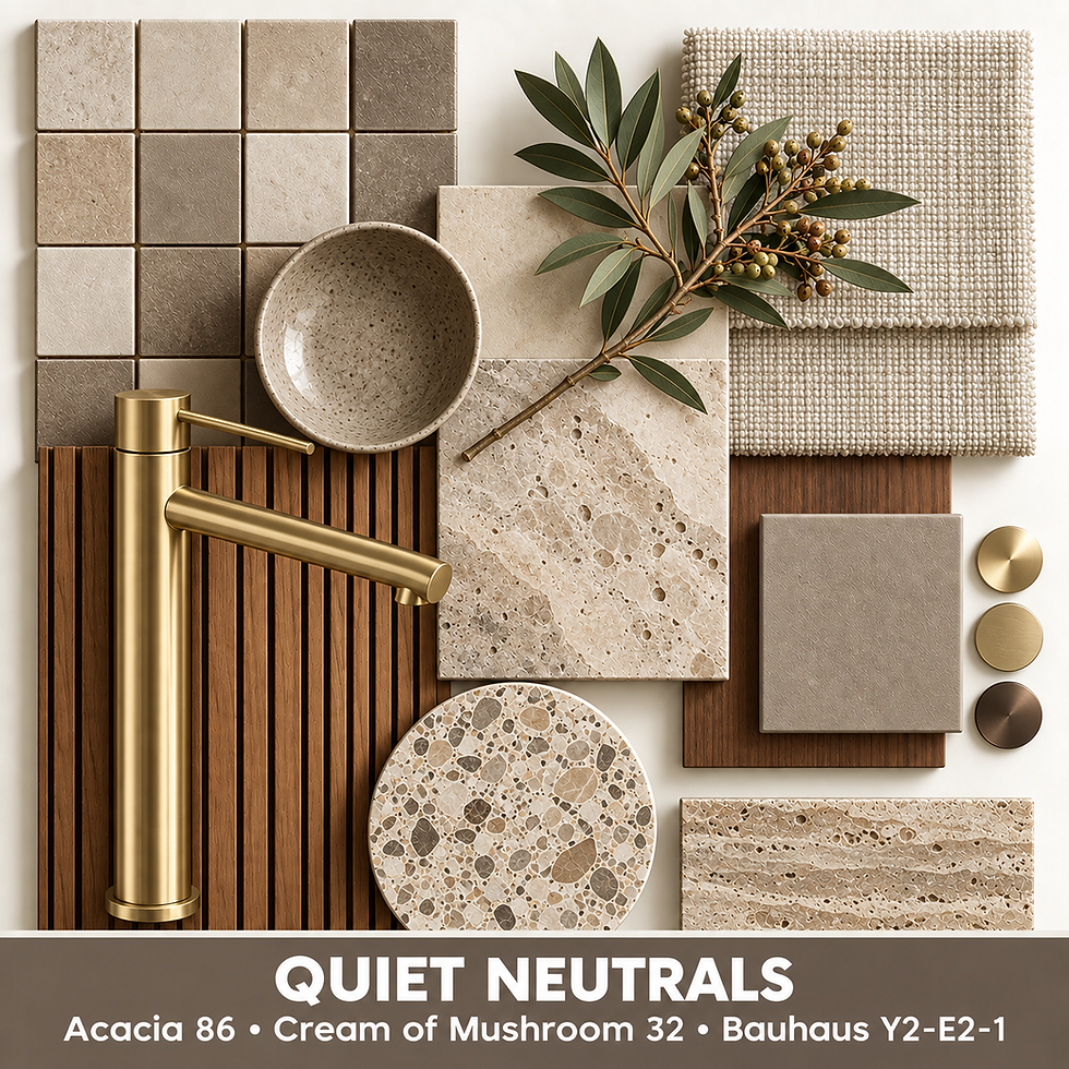
Quiet Neutrals
Quiet neutrals continue to provide a sophisticated foundation for bathrooms and wellness spaces.
Rather than stark white or flat beige, this palette combines warm stone, mushroom and mocha to create subtle depth.
The materials around these colours are what make them interesting: limestone, travertine, plaster finishes, handmade ceramics, natural textiles and warm timber all help prevent a neutral bathroom from feeling clinical.
The look
Warm stone, MushroomMocha Travertine and limestoneOak or walnutTextured linen and woven materials
Trending metal finishes
Gunmetal • Brushed Brass • Brushed Bronze
These warmer finishes complement the mineral quality of the palette, although chrome, black or gunmetal can also be introduced where the overall design calls for stronger contrast
Grounded Greens
Green has evolved into one of the most versatile colours for bathrooms because of the enormous range of tones available.
For our palette, the emphasis is on sage and olive rather than brighter botanical greens.
These shades work particularly well alongside natural timber, stone, handmade tile and textured surfaces. They create an immediate relationship with the natural world without requiring a bathroom to become overtly botanical.
The look
Soft sageDeep oliveNatural stoneWalnut and oakMatt ceramicsWoven textures
Metal can completely change the personality of this palette.
Warm metals such as brass, brushed brass and brushed bronze create an earthy and sophisticated combination, while gunmetal, black or brushed stainless steel can move the same colours in a more contemporary direction.

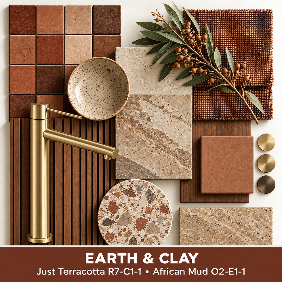
Earth & Clay
Terracotta, clay and cocoa tones introduce warmth and a sense of material authenticity.
This palette works beautifully when the surfaces themselves have variation — hand-finished plaster, imperfect ceramics, textured tile, terrazzo, timber and stone.
Rather than using terracotta as a decorative accent alone, we see it as part of a broader earthy palette.
The look
Warm stoneTerracottaCocoaOakWalnutTerrazzoTravertineHandmade ceramics
Trending metal finishes
Brass • Brushed Brass • Brushed Bronze
The relationship between these warm metals and clay-based colours creates a layered, tactile interior without needing excessive decoration.
Blue-Green & Teal
One of the strongest directions in our palette is the meeting point between blue and green.
These colours reference water without relying on predictable coastal blue. Instead, they move through teal, smoky blue-green and mineral tones.
Layered with timber, stone, textured fabrics and handmade tile, blue-green can feel both refreshing and sophisticated.
The look
Blue-greenTealSmoky mineral tonesDark timberTerrazzoVeined stoneTextured ceramics
Trending metal finishes
Gunmetal • Brushed Stainless Steel • Black • Chrome
These cooler finishes reinforce the mineral character of the palette.
For greater contrast, however, brushed brass against a deep teal or blue-green can be particularly striking, adding warmth without softening the drama of the colour.

Moody Charcoal
Dark bathrooms are no longer dependent on black-on-black styling.
The more interesting approach is to layer charcoal, smoky greys, deep blue and natural timber, allowing differences in surface and texture to create depth.
Stone veining, terrazzo, ribbed timber, matt ceramics and tactile textiles prevent a charcoal palette from feeling flat.
The look
CharcoalDeep mineral blueSmoky greyDark timberBlack stoneTerrazzoTextured surfaces
Trending metal finishes
Gunmetal • Brushed Stainless Steel • Black • Chrome
Black can almost disappear into this palette, while gunmetal and brushed stainless steel create subtle changes in reflectivity.
For a more expressive interpretation, brushed brass can provide a striking warm contrast against charcoal and near-black surfaces.

Plum: The Unexpected Accent
Plum introduces something very different to the otherwise mineral and earth-based palette.
It can be used as a strong feature colour, but it is equally effective in smaller amounts — a basin, vanity, tile, wall section or textile detail.
Against stone, walnut, charcoal or warm metal finishes, plum brings richness without becoming overtly decorative.
The look
PlumWine tonesCocoaWalnutMineral blueWarm stone
Finishes to explore
Brushed Brass • Brushed Bronze • Gunmetal • Black • Chrome
The choice depends entirely on whether the room is intended to feel warmer, more dramatic or more contemporary.

The Full 2027 Waterblessed Colour Palette
This is the complete Plascon reference palette used to develop the Waterblessed colour trend bMaterials Matter as Much as Colour
A colour moodboard should never be a collection of paint chips alone.
The real interior-design story develops when colour is viewed together with:
Stone • Tile • Timber • Terrazzo • Ceramics • Textiles • Metal finishes
A single green, for example, can feel completely different beside pale oak and brushed brass than it does beside walnut and gunmetal.
The same applies to charcoal. Pair it with black fittings and the result can be architectural and restrained. Introduce brushed brass and the contrast becomes warmer and more expressive.
That is why we build our colour palettes as material boards rather than colour cards.
They allow us to see the relationships before those materials enter the room.

Trends Are a Starting Point
We believe trend forecasting should inspire a design rather than dictate it.
A bathroom ultimately needs to belong to the home and to the people who use it.
The right palette therefore considers far more than what happens to be fashionable. It needs to work with the architecture, available light, materials, practical requirements and the atmosphere the client wants to create.
For 2027, the direction is clear: bathrooms are becoming warmer, more tactile, more individual and more confident with colour.
Whether that means the softness of mushroom and stone, the calm of sage and olive, the richness of terracotta and cocoa, or the drama of plum and charcoal, the opportunity lies in how those colours are layered with materials.
Colour sets the mood. Materials make it real.
Planning a Bathroom or Wellness Space?
Waterblessed provides independent bathroom and wellness design, product specification and procurement for residential and hospitality projects.
Design • Specify • Curate • Procure • Collaborate • Complete
Complete our Client Design Brief to start your project.
Best Wishes
2 ÓG'S


Comments